

SPACE & LIGHT · INTERIOR ATMOSPHERE
Warm Neutral Colours: How to Create a Welcoming Home Palette
From oatmeal and taupe to warm white and muted clay: choose a balanced palette that responds to your home’s actual light, materials and daily use.
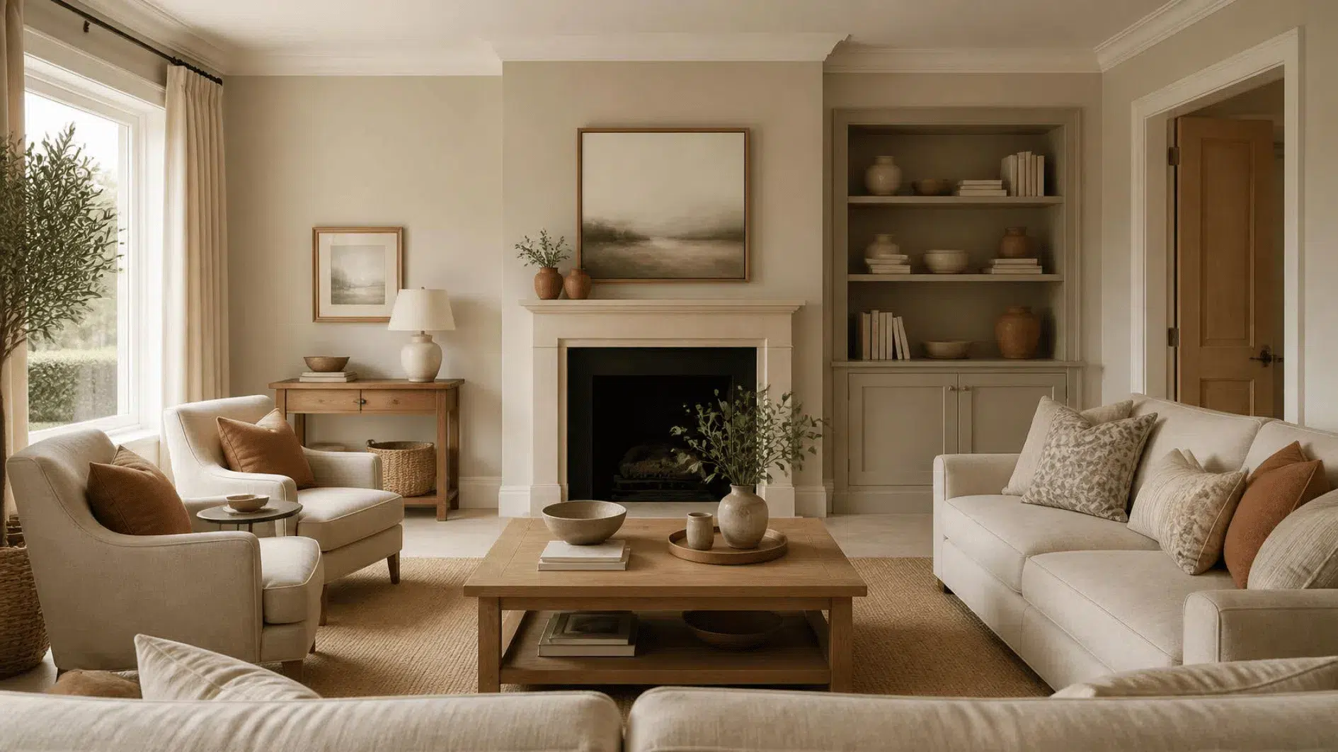
Warm neutral colours can bring an inviting sense of balance to a home, but choosing them is not as simple as selecting a shade called beige or warm white. Undertones, natural daylight, artificial lighting and your existing furniture all influence whether a colour feels coherent in a particular room.
The most successful palette is not necessarily the palest or most coordinated. It makes the flooring, furniture, textiles and personal objects work well together, with enough contrast to keep a room interesting and practical.
This guide explores warm whites, oatmeal, stone, taupe and deeper earthy accents, plus how to sample paint and adapt colours room by room. It complements the cosy home ideas guide and our cosy living room and cosy bedroom guides.
What Are Warm Neutral Colours?
Warm neutral colours are understated shades with an apparent warmth rather than a distinctly cool, blue or icy quality. Warm white, cream, oatmeal, beige, stone, taupe and some versions of greige can all belong in this family. The exact impression depends on the product, lighting and surrounding materials, not the colour name alone.
A neutral palette need not be pale. Brown, charcoal with a warmer cast, clay and deeper earthy shades can provide useful contrast. A balanced room usually contains some difference between light and dark, smooth and textured surfaces.
Warm neutrals are one way to create an inviting atmosphere, not a rule for every home. Our cosy home ideas guide places colour alongside lighting, furniture layout and comfort.
Start With the Colours You Already Have
Before reaching for paint charts, identify permanent and expensive-to-change elements: flooring, fitted cabinets, tiles, large upholstered pieces and substantial furniture. Their colours influence which neutral shades will feel coherent.
An existing grey sofa may work with a warm off-white wall, while a reddish timber floor may need a different supporting beige from a pale oak floor. The right palette is the one that responds to the actual room.
- Identify the largest fixed surface and its apparent undertone.
- Notice the room’s furniture and upholstery in daylight.
- Choose one existing colour to repeat or complement.
- Decide where contrast, rather than more matching, would help.
- Test alternatives before replacing serviceable pieces.
Understand Warm, Cool and Neutral Undertones
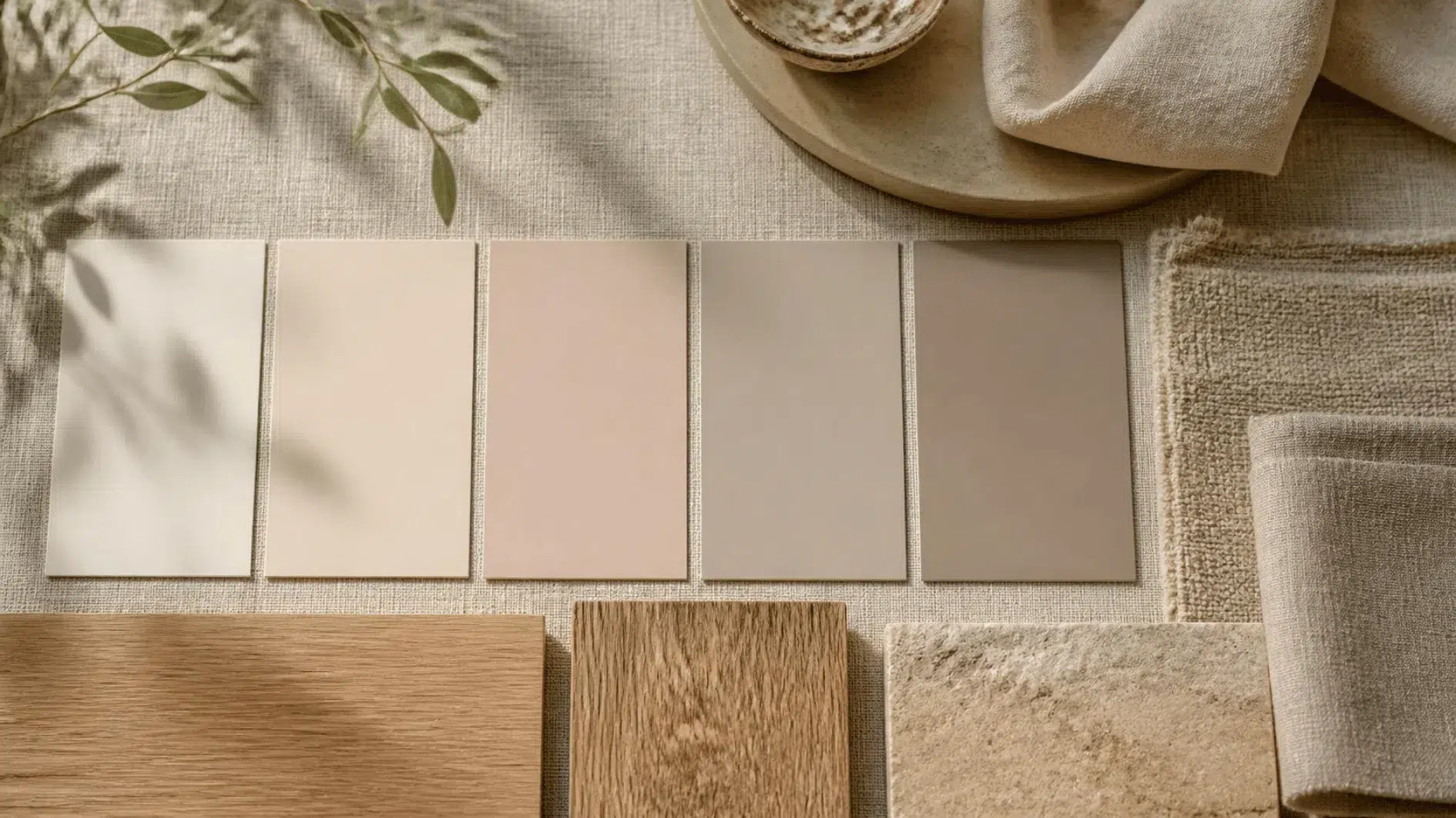
Undertone refers to the subtle colour cast that may become more noticeable when similar shades are compared. One beige can look pinkish, another yellowish, another slightly green or grey. A warm white may appear creamy against a cooler white surface.
Do not rely on a tiny sample or a screen image alone. Hold candidate materials against the furniture or flooring they will sit beside, and compare them under the lighting that matters in the room.
Undertones need not match perfectly. Strongly different casts can still be intentional when they are supported by other materials, but an unwanted clash becomes easier to see when colours are placed side by side.
Warm White: Softness Without a Yellow Room
Warm white can make a room appear light while giving it a gentler look than a very cool white. But the name does not guarantee a consistent finish: one brand’s warm white may appear noticeably creamy while another looks close to neutral.
Observe the shade on each wall, particularly beside white ceilings, doors, painted skirting and fitted units. A small difference that looks attractive on a sample can become pronounced across an entire room.
There is no need to repaint all joinery to match the walls. Check whether the existing contrast works before planning additional work.
Cream and Oatmeal: Welcoming, Versatile Neutrals
Cream and oatmeal shades often sit comfortably with natural textiles, ceramics and timber. Their appeal lies in how they connect materials rather than in creating an entirely beige space.
Be aware that warmer pale shades can look different against strong yellow, pink or grey surroundings. A fabric cushion or curtain sample may be a better starting point than an immediate wall repaint.
Vary light and dark values so the room does not become visually flat. Existing dark frames, books and furniture may provide enough contrast.
Beige and Stone: Choose the Right Depth
Beige covers a wide range of colours, from yellow-leaning sand to greyer or rosier versions. Stone usually suggests a muted natural quality, but those names do not define a colour standard.
For walls, compare several samples at the same time rather than remembering one from a shop visit. A colour that looks neutral on a printed card may respond strongly to daylight and nearby flooring.
Think about depth as well as undertone. A medium stone wall might lend more structure to a bright sitting room, whereas a pale beige may give a small space a quieter background.
Taupe and Greige: Balance Brown and Grey
Taupe and greige are useful descriptions for shades that sit between familiar neutral families. Some look warmer and browner; others carry stronger grey or violet undertones.
In a room containing cool grey upholstery, a carefully chosen greige may provide a transition to warm timber or cream textiles. In another setting, it may appear unexpectedly purple or dull.
Always compare real samples against fixed surfaces and observe them at multiple times of day. The label is a starting point for discovery, not a reliable prediction.
Use Clay, Terracotta and Muted Brown as Accents
A warm neutral palette often benefits from a stronger earthy note. Clay, terracotta, rust and deeper brown may work in cushions, a ceramic object, artwork or a painted feature when their proportions suit the room.
Introduce colour through something you already own before committing to large changes. One rich-toned object near a pale sofa might provide enough emphasis.
Use these accents in small or large areas according to personal taste; do not assume every neutral scheme requires terracotta to look warm.
Make a Neutral Room Interesting With Tonal Contrast
A room in which walls, flooring, upholstery and furniture all share a similar mid-tone can appear flat. Variation in lightness and darkness often does more than buying further decorative objects.
A dark timber side table beside an oatmeal sofa, a light fabric against a deeper wall or a black picture frame near warm white paint can help define different elements.
The contrast should still suit the atmosphere you want. A softer difference may work in a quiet bedroom, while a more pronounced contrast can help structure a family living room.
How Daylight Changes Warm Neutral Colours
Daylight does not have one constant colour or intensity. A sample can look different in morning sun, under overcast skies or in a shaded north-facing room. Window size, neighbouring buildings and the materials outside also affect the light entering a room.
Descriptions such as north-facing and south-facing can be helpful starting points, but they are not enough to choose a paint colour confidently. Test the actual space and compare several walls.
Do not assume a warm neutral will always look cosy or that a cool colour cannot work in a shaded room. The full palette and practical lighting matter.
Test Paint and Fabrics Under Your Actual Lamps
Bulb specifications, shades and lamp positions can alter how wall and fabric colours appear in the evening. A warm-looking light may emphasise cream and earthy tones, but the exact result varies with the source and materials.
Look at samples under both daylight and the lamps you normally use. For reading or other tasks, preserve adequate brightness rather than choosing low-output bulbs solely to flatter paint.
Our lighting for a sitting room guide
How to Test Warm Neutral Paint Colours Before Committing

Small paint cards and digital swatches may not show how a finish will look on a whole wall. Obtain manufacturer samples where possible and apply or display them according to the product’s instructions.
- Choose a limited range of possible shades rather than dozens.
- Compare the samples near major furniture and flooring.
- Look at more than one wall, as illumination can vary.
- Observe the samples in morning, afternoon and evening light.
- Allow applied paint to dry and follow the manufacturer’s guidance before judging.
- Check sheen, finish and the suitability of the product for the surface.
If a painted sample would not be permitted in a rented home, use appropriately prepared sample boards or swatches instead. Do not damage finishes merely to test a colour.
Consider Paint Finish and Surface Practicality
Matt, eggshell and other finishes can reflect light differently and require different maintenance. A colour that appears pleasing on a small smooth card may read differently across a textured wall or a more reflective surface.
Choose a finish suitable for the room, substrate and cleaning needs. Kitchens, bathrooms and busy family areas may require particular performance; product specifications should guide that choice.
Follow preparation, ventilation and application instructions. Colour and finish are separate decisions, and neither should override proper surface suitability.
Pair Warm Neutrals With Wood Tones
Timber brings grain and its own colour cast. Pale oak, dark walnut and reddish older woods can all sit alongside warm neutrals, but the best combination depends on proportion and light.
You do not need to make every wooden piece identical. Compare the main floor and furniture first, then let a few accents connect them without creating a rigid matched set.
For finishes and proportion, see our wooden home decor guide. Repairing or repositioning existing furniture may be more sensible than replacing it for a new colour scheme.
Bring Warm Neutrals to Life Through Fabric and Ceramics
A palette made largely of similar shades can gain depth through surfaces: woven linen, smooth ceramics, timber grain and upholstered texture. These materials catch light differently even when their colours are close.
Avoid adding more objects purely to display another neutral. A useful cushion cover or favourite bowl may already provide enough variation.
Our linen home decor guide addresses fabric weight and care, while the ceramic home decor guide considers form, glaze and safe practical use.
Warm Neutral Colour Ideas for the Living Room
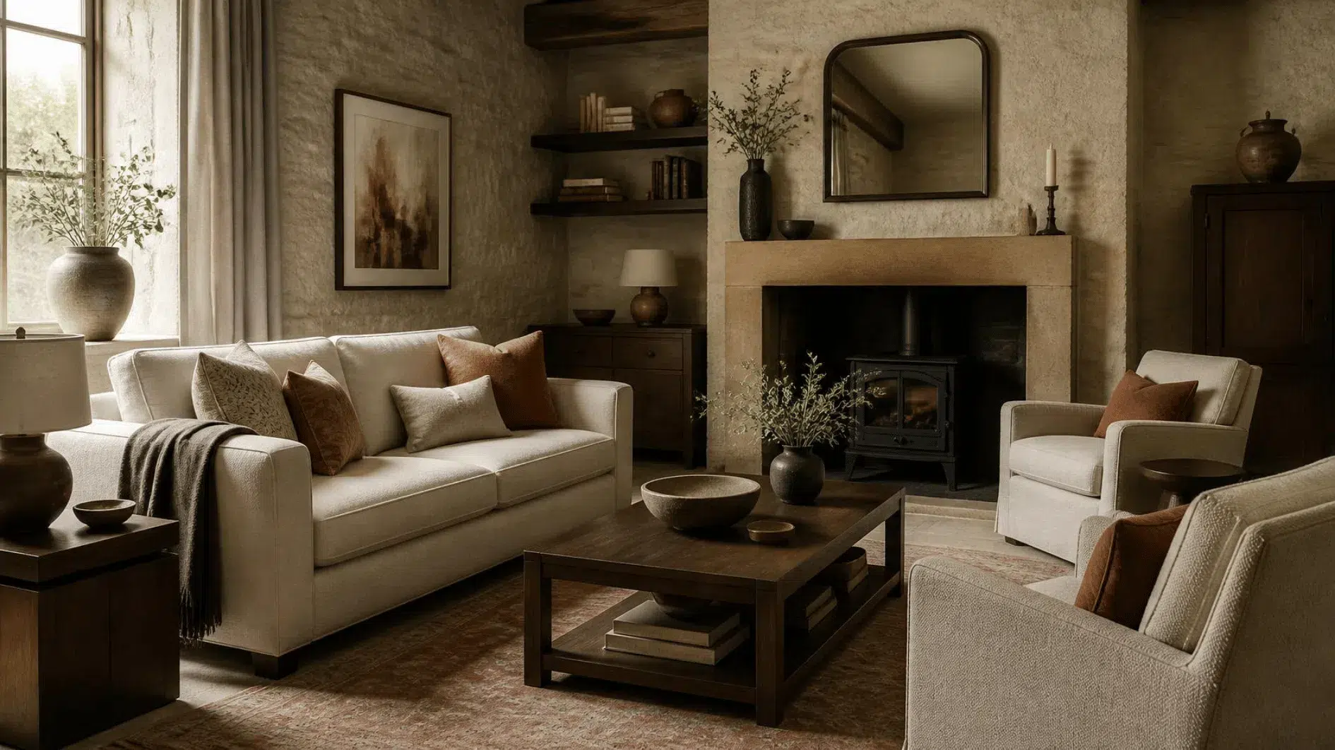
Living rooms often contain varied materials acquired over time. Start with the sofa and floor, then consider whether lighter walls, darker wood or one warm accent could bring the arrangement together.
Use textiles or framed artwork to test colours before repainting. A living room with a grey sofa, for example, may benefit from a muted warm neutral nearby, but the correct shade depends on the sofa’s own undertone.
Read our cosy living room ideas guide for seating, rugs and lighting that support the atmosphere beyond the palette.
Warm Neutral Bedrooms Without an All-Beige Scheme
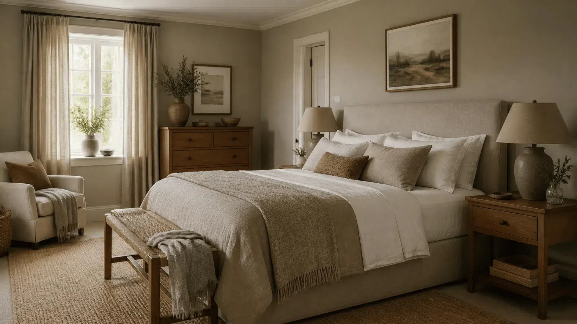
A bedroom palette can feel welcoming through gentle contrast, comfortable textiles and the relationship between bed, curtains and bedside furniture. There is no obligation to make every surface the same pale tone.
Try a slightly deeper wall shade with lighter bedding or a warm-white background against darker timber. Sample any proposed paint next to fabrics in daylight and lamplight.
Our cosy bedroom ideas guide covers practical bedroom arrangement and lighting without claiming that decor treats sleep problems.
Warm Neutral Colours for Kitchens and Dining Areas
Kitchen palettes must work around units, worktops, splashbacks and flooring that may be expensive to change. A supporting wall colour can relate to existing finishes without trying to disguise every difference.
In a dining area, natural timber and suitable table textiles may introduce warmth more easily than a repaint. Observe colours alongside the lighting used for meals.
Keep product choice practical: wall and cabinet paints must suit their surfaces and the cleaning expected of them. Do not select a delicate finish solely because its colour looks attractive.
Choose Warm Neutrals for Hallways and Transitional Spaces
Hallways connect rooms with different lighting and colours. A neutral that relates to floors, door frames and adjoining walls may make movement between spaces feel more coherent.
Narrow halls may benefit from practical lighting and clear access more than a dramatic paint change. Test a proposed shade in the corridor itself rather than relying on its appearance in a bright living room.
Choose surfaces and finishes suitable for frequent contact and maintenance, especially around entrances and busy family routes.
Use Warm Neutral Accents in Bathrooms
Bathrooms contain tiles, fixtures and mirrors that strongly influence colour. A warm neutral textile or suitable ceramic accessory may make a difference even where wall finishes cannot be changed.
If painting, choose products appropriate for humid environments and follow ventilation, preparation and safety guidance. Not every standard interior paint suits every bathroom surface.
Avoid adding absorbent fabrics where they will remain wet; practical use and cleanability should guide the arrangement.
Warm Neutrals in Small Rooms and Rented Homes
A small room need not be pale to feel comfortable, and a rented room need not be repainted at all. Begin with existing flooring, furniture and permitted furnishings.
A change of curtain position, an owned fabric, appropriate lamp placement or one relocated object can alter the apparent balance. Avoid introducing unnecessary furniture merely to carry an accent colour.
Our minimalist home guide considers space, scale and uncluttered movement. Check tenancy permissions before making permanent changes.
Create a Whole-Home Palette Without Matching Every Room
A cohesive home can contain different room colours. Repeating selected undertones, materials or accents provides connection, while allowing living rooms and bedrooms to meet different needs.
Start with what is visible from connecting doorways and the fixed surfaces that already run between rooms. You may find that existing wood tones or textiles provide a natural link.
Do not repaint serviceable rooms solely to impose one neutral throughout. Coherence can come from thoughtful relationships rather than uniformity.
Common Mistakes With Warm Neutral Colours
- Choosing by shade name alone. Beige, taupe and warm white vary widely between products.
- Ignoring undertones. Small differences can become stronger beside flooring and upholstery.
- Judging a colour only on a phone. Screen images are not reliable paint samples.
- Testing in only one lighting condition. Daylight and lamps can change the appearance.
- Making every surface the same value. Tonal contrast can provide structure.
- Forgetting care and finish. The surface and room should determine paint performance.
- Buying matching accessories unnecessarily. Existing objects may already connect a palette.
- Treating warm as universally better. Comfort and colour are personal, and room conditions vary.
Five Practical Warm Neutral Palette Starting Points
| Palette direction | Main neutral | Supporting contrast |
|---|---|---|
| Soft and light | Warm white with oatmeal | Natural timber and an existing darker frame |
| Earthy and grounded | Stone or warm beige | Muted clay, deep brown or terracotta |
| Balanced grey and warmth | Suitable greige or taupe | Timber and cream textiles |
| Deep and inviting | Mid-tone taupe | Warm white, dark wood and tactile fabrics |
| Fresh with natural contrast | Oatmeal or muted stone | Deep green, ceramics and timber |
These are relationships rather than fixed colour recipes. The names do not specify exact paint formulations, so validate real products with samples before applying them.
A successful palette does not require buying each listed element. Use existing furniture, textiles and personal objects wherever they already provide the balance.
A Warm Neutral Colours Checklist
- Identify the undertones of existing flooring and major furniture.
- Choose a small group of possible neutral shades.
- Compare paint and fabric samples in the actual room.
- Look at the shades in daylight and under the lamps you use.
- Consider tone and contrast, not only hue.
- Check paint finish, substrate and maintenance requirements.
- Bring texture through suitable items already owned.
- Allow rooms to vary while repeating selected colours or materials.
- Confirm tenancy permissions before decorating.
- Change only what improves the room or solves a real problem.
Frequently Asked Questions About Warm Neutral Colours
What are examples of warm neutral colours?
Warm white, cream, oatmeal, beige, stone, taupe and some greige shades are common examples. Each product can have different undertones, so colour names are not precise specifications.
How do I tell whether a neutral has a warm undertone?
Compare several physical samples next to one another and against your flooring and upholstery. Subtle yellow, red or brown casts may become more apparent beside a cooler sample.
Can warm neutral colours work with grey furniture?
Yes, but the combination depends on the grey’s undertone and the lighting. Test candidate colours directly against the furniture before deciding.
Are warm neutrals suitable for north-facing rooms?
They may be, but orientation alone does not determine the result. Check the actual light, surrounding surfaces and your preferences with samples.
Do all warm neutral rooms have to be beige?
No. Warm whites, deeper browns, earthy accents and muted colour can create variation. Personal objects and contrasting materials matter too.
What is the difference between beige and greige?
Beige generally describes a brownish neutral, while greige suggests a combination of grey and beige. The specific colour and undertone still vary by product.
Choose a Palette That Works With Your Home
Warm neutral colours are most useful when they connect a room’s existing materials, light and everyday function. Start with what cannot easily change, observe undertones and test the shades you are considering under real conditions.
You do not need a perfectly coordinated beige home. A few considered relationships between walls, timber, textiles and personal objects can create a welcoming atmosphere while keeping the space practical and your purchases intentional.

Leave a Reply